TIAA Design System & Insight Hub Experience
Enterprise-scale system design unifying marketing, content architecture, and data visualization across 500+ pages — built to scale across multiple audiences, brands, and cross-functional teams.
Project Overview
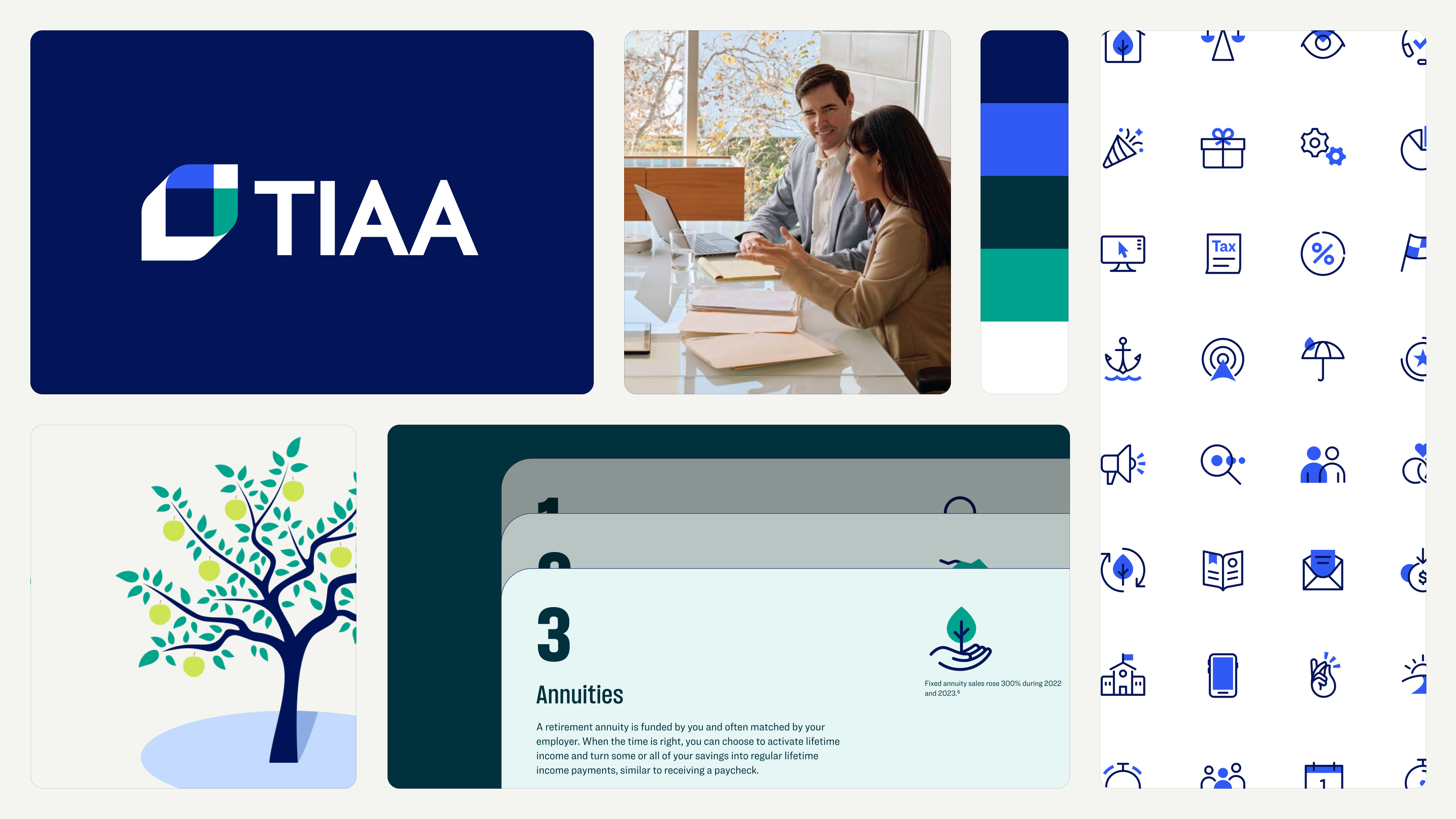
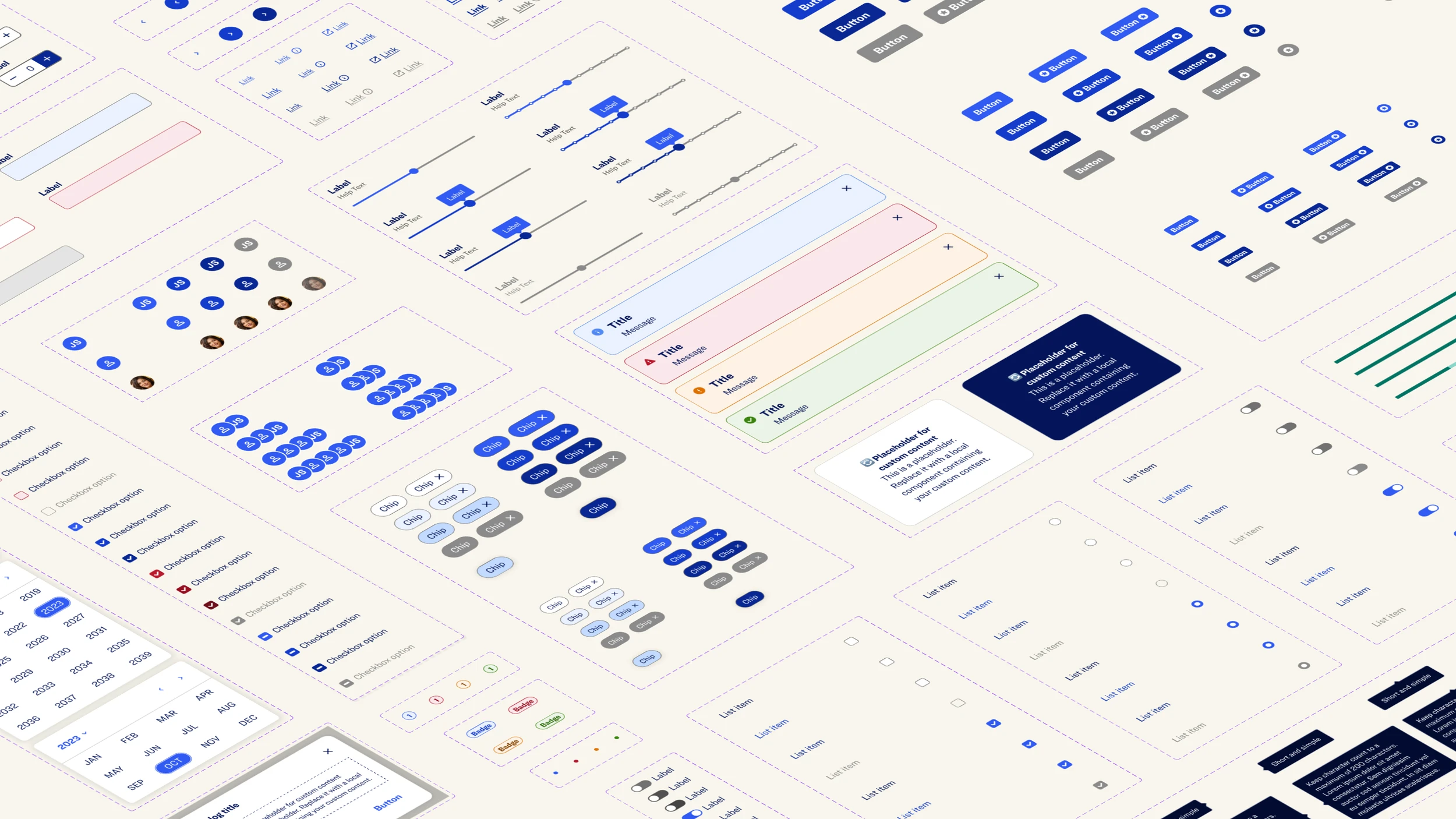
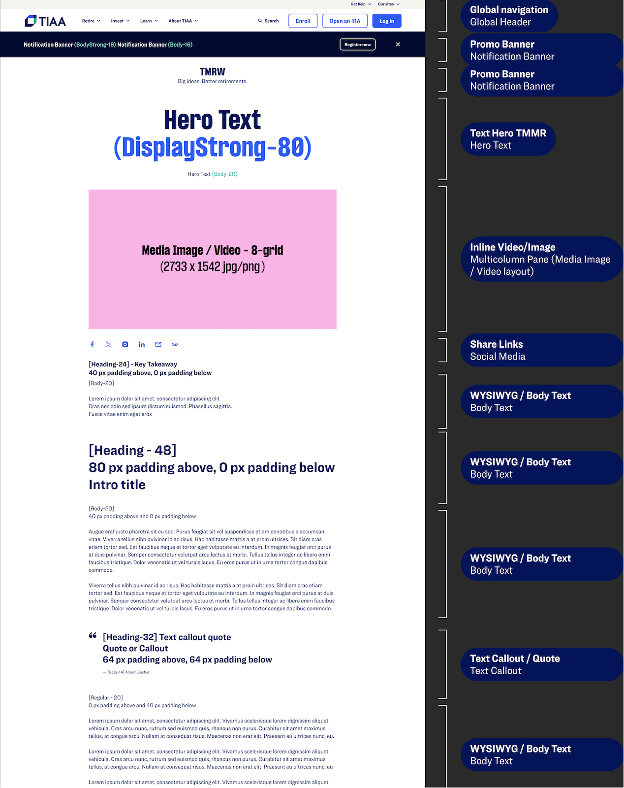
Led the design of TIAA's Financial Services Enterprise Design System — a semantic token architecture and 65+ production-ready patterns enabling marketing teams to ship 500+ brand-consistent pages across AEM without engineering bottlenecks.
Work Scope
Type
Enterprise design system, Brand execution
Duration
4 months
2022 – 2024
Methods
Token architecture, Component audits, AEM integration
Tools
Figma
TIAA launched a new brand but couldn't execute it at scale.
Marketing teams needed to ship 500+ pages across three audiences while maintaining consistency. Critical gaps emerged across design, engineering, and AEM workflows — all disconnected.
A Marketing Design System that translated brand guidelines into production-ready patterns — self-enforcing by design.
I led the creation of a semantic token foundation and built 65+ patterns with AEM authoring constraints baked in. Spacing rules, responsive behavior, and content limits were embedded directly into components — eliminating subjective decisions. Marketing teams could author independently while maintaining brand integrity across all four palettes.
Strategic Workstreams
Marketing Design System
Token architecture, atomic components, production patterns
Insight Hub Architecture
Content taxonomy, component system, information hierarchy
Data Visualization Layer
Chart strategy, consultant workflows, decision tools
My Role: System Architecture & Cross-Functional Leadership
I didn't just design components — I owned the system architecture decisions that connected design, content, and engineering across a multi-year transformation. My role required bridging strategic product thinking with hands-on design execution, leading cross-functional teams through ambiguity, and establishing governance models that would outlast my tenure.
Scaling a century-old brand across enterprise marketing
TIAA launched a new brand but couldn't execute it at scale. Marketing teams needed to ship 500+ pages across three audiences while maintaining consistency — and the gaps were costing real money.
Token Architecture & Semantic Foundation
The team built a semantic token structure across four brand palettes — Default, Union, Laurel, and Grey. Every pattern used tokens meticulously: no hex values, no one-off choices. I led the design of 65+ patterns using atomic design principles, each built for AEM's authoring model.
Component properties, boolean variants, and instance swaps ensured patterns only offered valid configurations. Consistency became structural, not enforced through reviews. This token-first approach meant a palette swap required zero redesign — the system adapted automatically.
Multi-Audience Validation Strategy
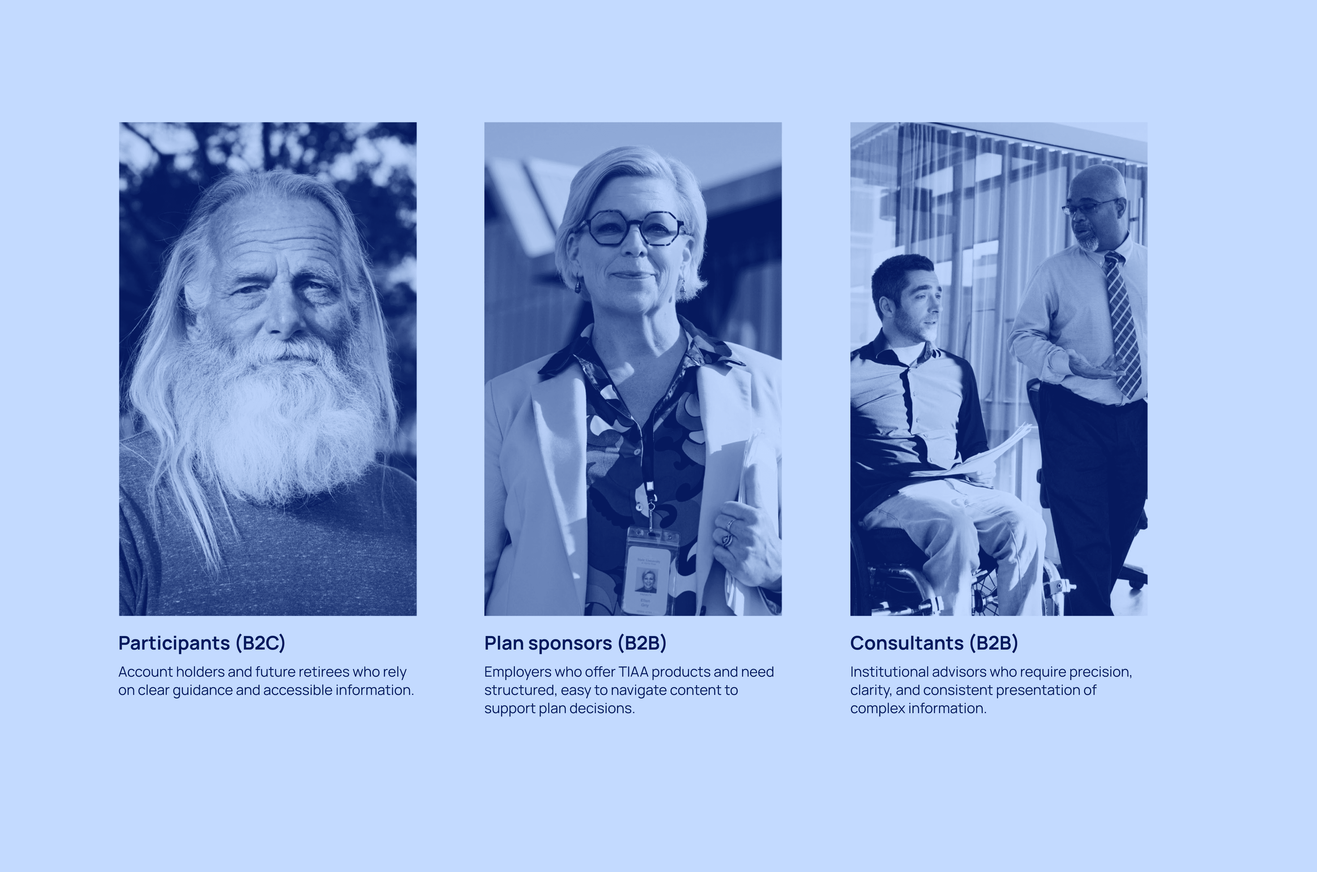
TIAA serves participants (retirement savers), plan sponsors (employers), and consultants (financial advisors). Each needed different content strategies but the same brand consistency.
We used AI to prototype quickly, then ran moderated testing with users from each group to validate that patterns could flex through content and palette without requiring separate designs. Testing confirmed participants needed education, sponsors needed ROI, consultants needed data — but the same structural components worked across all three.
Production-Constrained Pattern Engineering
I worked directly with engineering to bridge design intent and CMS constraints — eliminating interpretation gaps entirely. Every pattern included authoring rules: maximum character counts, required image dimensions, allowed component combinations. This wasn't design documentation — it was production specification.
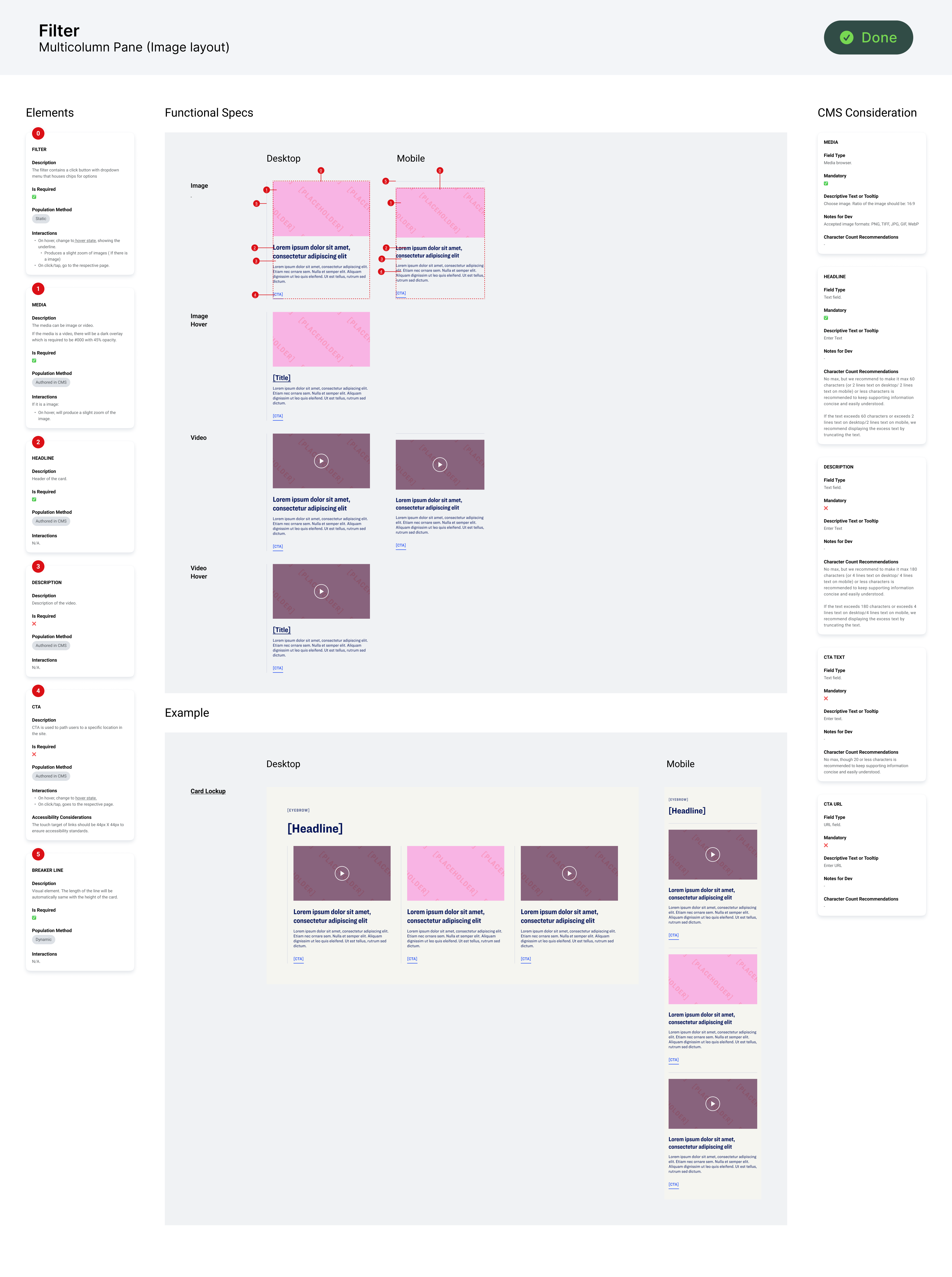
Template System & Scalable Assembly
As volume scaled to 500+ pages, I introduced templates to shift from custom design to standardized assembly. Predefined content zones, pattern sequencing rules, encoded responsive logic.
Templates weren't just wireframes — they were decision frameworks. Each template defined which patterns could appear, in what order, with what content constraints. Marketing teams could now assemble pages without designer intervention, while maintaining brand integrity.
Market Validation
The system didn't just ship faster — it performed.
The Account Homepage won a Gold Medal from Corporate Insight. The Lifetime Income page drove 94% growth in advice sessions. The public homepage saw an 80% surge in enrollment starts. 500+ pages launched accessible by default.
94%
Growth in advice sessions
80%
Surge in enrollment starts
41%
Bounce rate reduction
76%
SEO improvement