TIAA Insight Hub & Case Study
A full redesign of the consultant portal's content hub — featuring intelligent components, smart filtering, data visualization, and case study storytelling designed to arm consultants with faster access to critical financial insights.
Company
TIAA
Audience
B2B Consultants
Disciplines
UX Design · Content Architecture · Data Viz
Project Overview
Redesigned the TIAA consultant portal's content hub — creating intelligent filtering, smart component architecture, data visualization tools, and rich case study storytelling to give financial consultants faster access to the insights that drive client decisions.
Work Scope
Type
Portal redesign, Content architecture
Duration
12 months
2023 – 2024
Methods
User research, Content taxonomy, Prototype testing
Tools
Figma, Figjam, Lookback, AEM
Redesigned Hub Experience

The Challenge
Consultants have become crucial decision makers in retirement plans. How do we reach them?
90% of top 200 clients work with consultants. Consultants are at the tip of the spear when decisions are made about retirement plan providers. It is vital to our success that consultants understand—and recommend—TIAA's lifetime income solutions.

The Solution
The redesigned Insight Hub gives TIAA consultants faster access to timely, client-ready insights—anytime, on any device. With streamlined navigation and smarter content organization, consultants can respond quickly to market changes and strengthen client relationships.
Insight Hub Experience
A comprehensive redesign of the consultant portal's content hub, featuring intelligent components that adapt to user needs and streamline access to critical financial insights and resources.
Information Architecture & System Structure
The hub's content hierarchy was designed as a layered system — from high-level navigation down to atomic card variants — ensuring every component serves a clear role in the consultant's content discovery journey.
Hub Page
Entry point
Content Types
Articles · Media · Docs
Filter Taxonomy
Topic · Date · Type
Card Variants
Image · Text · Data
Detail Pages
Full view · Related
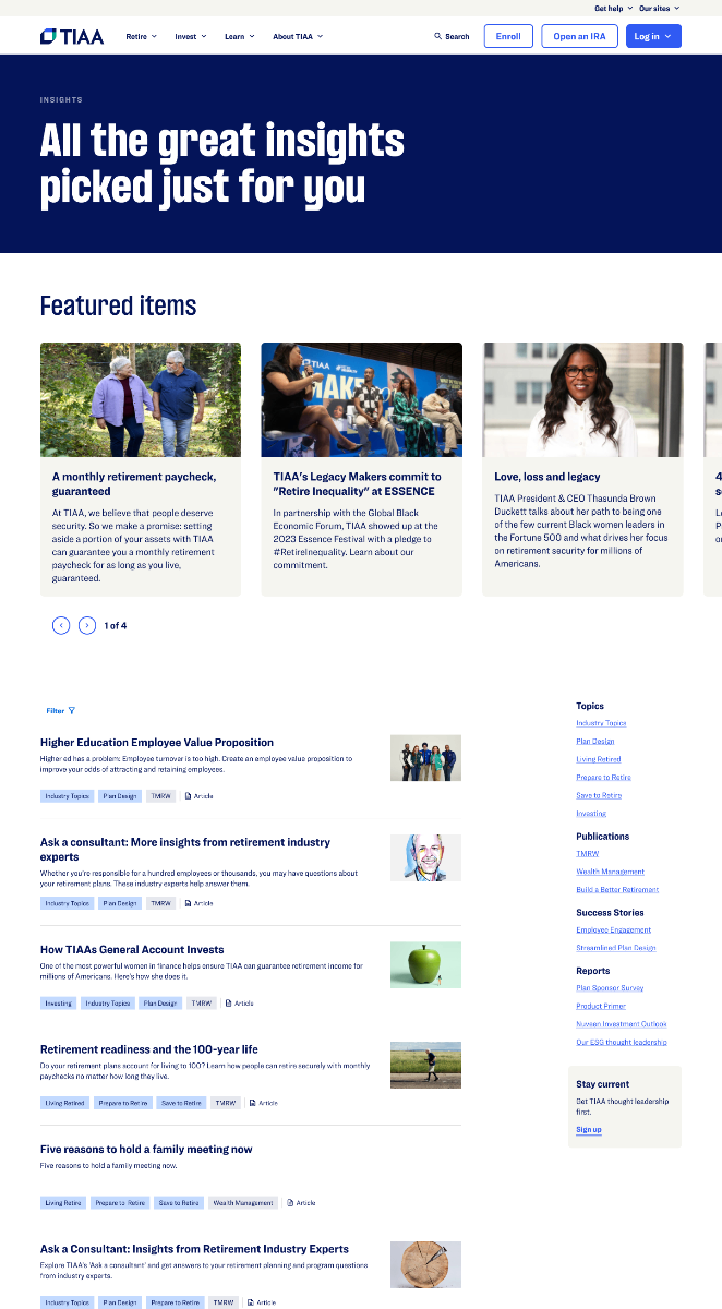
Main Hub Page
Dynamic Rail
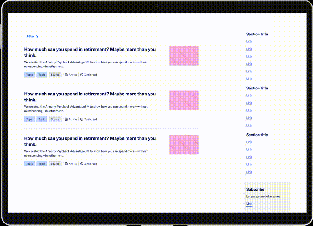
Replaced a static, one-size-fits-all banner with an adaptive content rail. Three card lockup variants — image-led, text-only, and data-focused — ensure every resource type is surfaced with the right visual weight.
Eliminated broken image states — graceful fallback for resources without thumbnails
Reduced scan time — visual hierarchy signals content type at a glance
Smart Filter
Introduced a chip-based filter system designed from scratch — replacing a buried, hard-to-discover dropdown. Consultants can now filter by topic, date, or content type in a single interaction.
Faster targeted access
Brand-aligned chip styles
Article Card
Evolved through three design iterations — from a cluttered read-time-heavy layout to a clean, left-aligned card that prioritizes title and metadata for faster content decisions.
Improved scannability
Cleaner information hierarchy
Component Design Iterations
Each component went through multiple rounds of design and validation — shaped by AEM constraints, user testing, and cross-functional collaboration. Below is the iterative evolution of the three core components.
Dynamic Rail Design
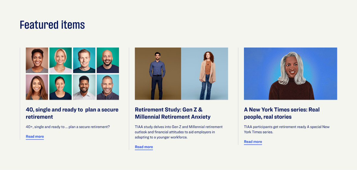
I collaborated with the design system team on implementing the dynamic rail component to showcase featured resources like articles and key financial data. Three card lockup variations were created to handle different formats of resource information — ensuring critical content like images or financial data is always surfaced with the right visual weight.
Original
Redesigned Variations
Highlights visually rich content where a strong hero image drives engagement and signals content type at a glance.

Hero image anchors visual hierarchy, reducing scan time for content type recognition
Consistent card height maintains rail rhythm across mixed content types
Used for text-heavy resources like reports or documents — keeps the rail visually consistent while maximizing content density.

Eliminates broken image states — gracefully handles resources with no available thumbnail
Prioritizes metadata and title, giving consultants faster access to document-type resources
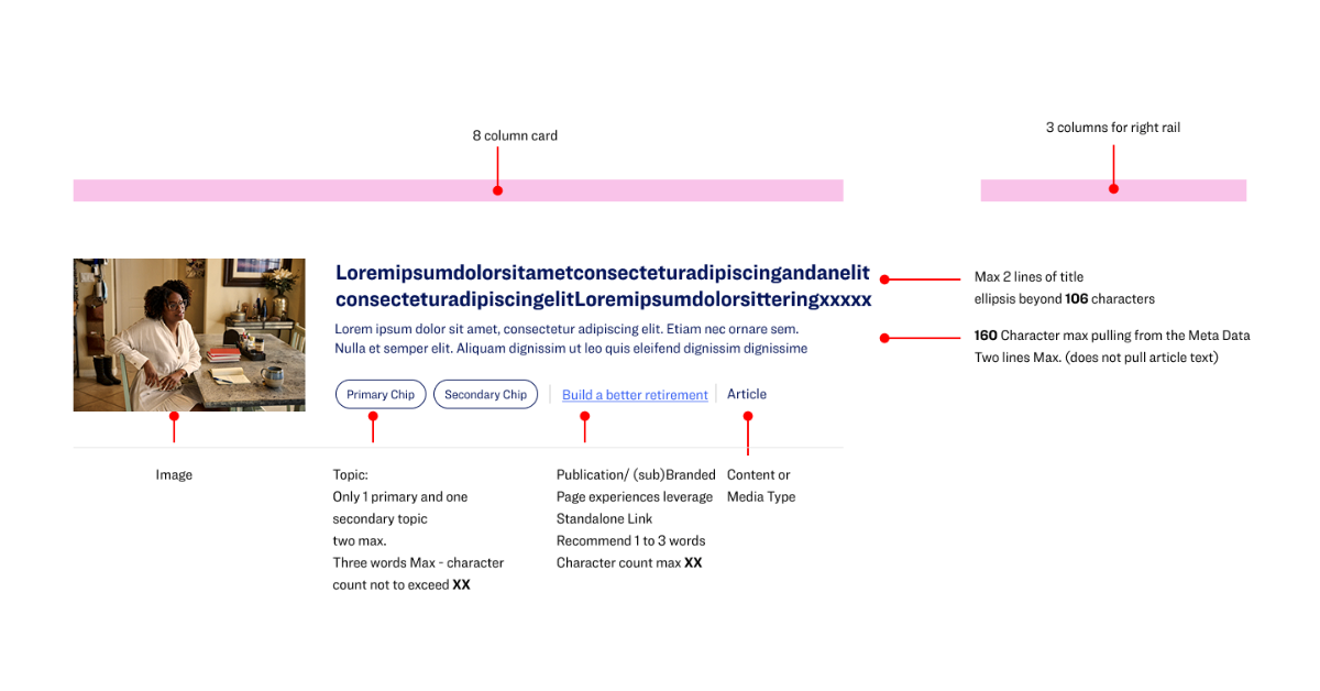
Article Card Design
The article card presents key details — title, summary, tags, and estimated reading time — to guide viewers in selecting content. Its design began with a mockup and evolved through three iterations to achieve the optimal balance between imagery and article information.
Iteration 1 — With Read Time

Iteration 2 — Left Align

Smart Filter System Design
The filter feature is critical in the insight hub main page as it enables consultants to browse by topic or content type — articles, media, or documents — for faster and more targeted access to resources. I designed the filter chip styles, status, and the filter flow in collaboration with the design system team, ensuring a clean, intuitive look that aligns with the brand.
Arming Consultants with Knowledge
Why Case Studies Matter
Consultants stay ahead with TIAA's breakthrough thought leadership—topical, powerful, and effortless to share with customers and colleagues.
By exploring successful case studies, they gain insight into how TIAA helps clients stay ahead of the game and discover the unique advantages we offer.

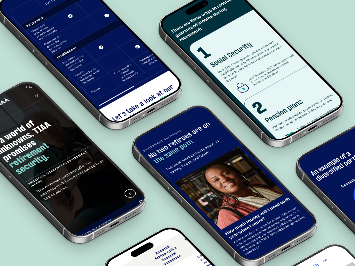
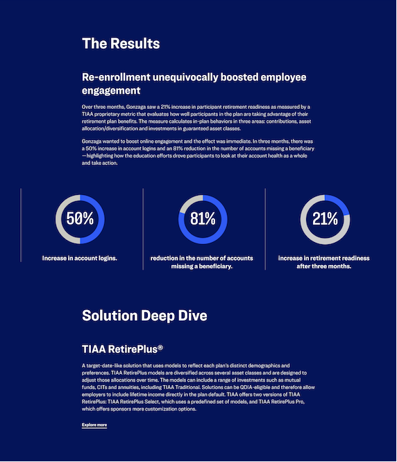
Financial Case Study with Data Visualization
The financial case study with data visualization clearly presents a challenge and its significant results with TIAA. It strengthens credibility and helps consultants quickly see the value, make informed decisions, and connect results to their own goals.
Article Template with Annotations
Financial Data Visualization as Product Strategy
Data visualization wasn't just about making charts look good — it was a deliberate product strategy to turn complex financial information into consultant-ready decision tools. Every chart type, every data point, every visual treatment was designed to support the consultant's workflow from pre-call preparation through client meetings to follow-up actions.
Visualization Strategy Framework
A systematic decision framework that maps data types to chart selections based on audience context and communication goals — ensuring every visualization serves a clear strategic purpose in the consultant's workflow.
Turning Complex Data into Intuitive Visual Stories
Financial data is dense by nature — multi-variable, time-dependent, and loaded with jargon. My role was to act as a translator: absorb the complexity, identify what the consultant actually needs to communicate, and design a visualization that makes the right insight immediately visible.
My Design Translation Process
Absorb the Data
Review raw financial datasets — identify variables, time ranges, outliers, and relationships that matter to the end goal.
Define the Insight
Ask: what single truth does the consultant need to communicate? Strip away everything that doesn't serve that one message.
Select the Form
Match data structure to chart type. Consider cognitive load, visual hierarchy, and how the chart will be read in context.
Design for Clarity
Apply visual design — color, spacing, labels, annotations — to guide the viewer's eye and remove any ambiguity.
Beyond Charts — Illustration System
A Cohesive Visual Language for Financial Concepts
Charts alone can't carry the full experience. A custom illustration system was designed to make abstract financial concepts approachable, on-brand, and memorable.

Consistent Style
Flat geometric forms align with TIAA's brand identity across every touchpoint.
Reduced Cognitive Load
Abstract concepts become instantly familiar — no financial jargon needed.
Scalable Library
40+ illustration assets designed for reuse across desktop, tablet, and print.